3 tips for more accessible social media
Hannah Burgeois, public outreach officer for Broward MPO shares tips for making sure your social media content speaks to everyone—no exceptions.

Organizations that want to stay relevant and respected must embrace inclusivity.
But inclusivity and accessibility are connected, especially on social media. Here are three tips to bring your social media program up to speed with these expectations:
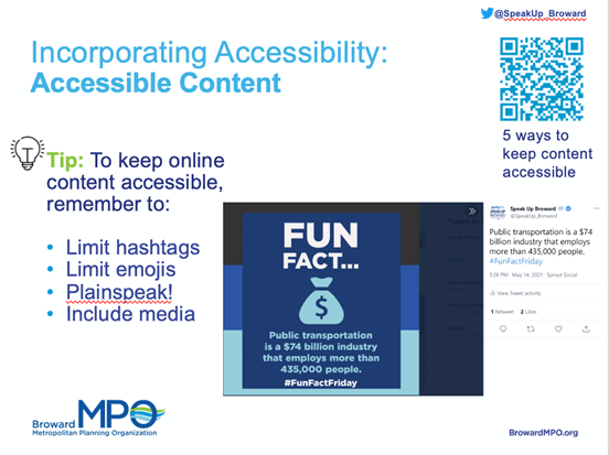
1. Rethink hashtags and emojis. “Social media content must now be designed to connect all communities and amplify all voices,” says Hannah Bourgeois, public outreach officer at Broward MPO. “That means some social media conventions like hashtags need to be reconsidered.”
Hashtags can be challenging for those with dyslexia, cognitive disabilities and visual impairments—in part, because screen readers can’t decipher them.
Her advice: “Limit hashtags because the words flow together without spaces. When you have to use them, initial capitalize each word.” (This is also called “camel case.”)
Similarly, “Limit emojis and add them to the end your copy if you really want them,” suggests Bourgeois. “Because the code for emojis can be lengthy, screen readers have to read through that before jumping to the copy.”
Here’s a sampling of what blind people hear when using screen readers like VoiceOver to decipher emojis:
- “Smiling face with sunglasses” 😎
- “Winking face with stuck-out tongue” 😜
- “Smiling face with clenched teeth” 😁
Those excerpts probably don’t quite convey the feeling you’re hoping to express.
Bourgeois offers this solution: “Since you only have a few seconds to grab the attention of your audience, plainspeak is a must to create easily digestible pieces of information. Also avoid large chunks of copy—the shorter, the better.”
2. Incorporate accessibility tools and training. “If you’re linking to a page from a social media post, try to send people to your accessible pages,” says Bourgeois.
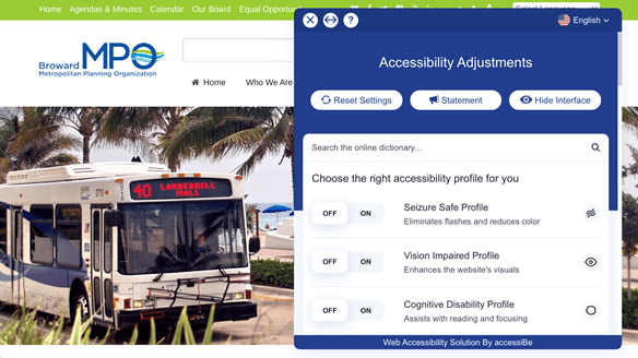
She recommends the Accessibe website plug-in, which allows viewers to fully customize their viewing experience with vision impaired profiles, cognitive disability profiles, ADHD friendly profiles and more. The pop-up also allows users to change colors and font size, as well as turn moving images into still elements.
Here’s what it looks like on the Broward MPO home page:
Bourgeois says social media teams should also engage in accessibility training. She recommends Deque University, which provides free online accessibility training, in addition to a paid module. The site currently hosts over 75 free public webinars covering all topics under accessibility.
3. Get graphic—with alt text and video. “Alt text helps keep graphic and photo content accessible,” Bourgeois says. “You want it to be succinct, but you also want to include enough information to fully explain your image or graphic.”
Alt text, or alternative text, is written material that describes non-text online content for screen readers. Think of it as an embedded caption.
In the chart below, for example, the descriptive text may read: “Chart showing the cost of Broward MPO mobility projects by cost in 2019.” It would then cite the data.
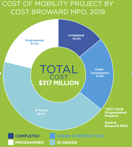
Bourgeois also advises being careful with color contrast. “You wouldn’t want to create a dark grey graphic and have black text in the foreground,” she says. “Instead, look for complementary colors that provide enough contrast between the different elements of the graphic.”
Similarly, “Use easily legible fonts,” she says. “Look for sans serif, looser kerning (space between letters) and heavier weight typography so your text stands out more.”
When it comes to video, Bourgeois offers these guidelines:
-
-
- Include captions. YouTube, Zoom and even PowerPoint include features to add captions to video calls.
- Include voice over. This is especially important if you have copy on the frame that’s important.
- Eliminate strobe and flashing lights. They can trigger people who suffer from seizures.
- Offer transcripts. Connect with your copywriters to get copies of scripts.
- Remember color contrast. As with graphics, maximize contrast. That doesn’t mean you need to limit yourself to black-and-white. Tools like WebAIM’s contrast checker can help.
-
Brian Pittman is the Dean of Ragan Training and a Ragan Communications event producer.


