The new look: Intranet redesign emphasizes usability and transparency
Relying on associates’ feedback, the new Nemours Net helps users navigate faster and better.

The purpose of an intranet is to provide a gateway into an organization’s inner workings so employees can find the information they need with ease. The Nemours Foundation’s redesigned Nemours Net intranet does that, and more: It offers an attractive, easy-to-navigate portal for employees looking for answers, while also enhancing the Foundation’s brand identity as one of the nation’s largest integrated pediatric health systems.
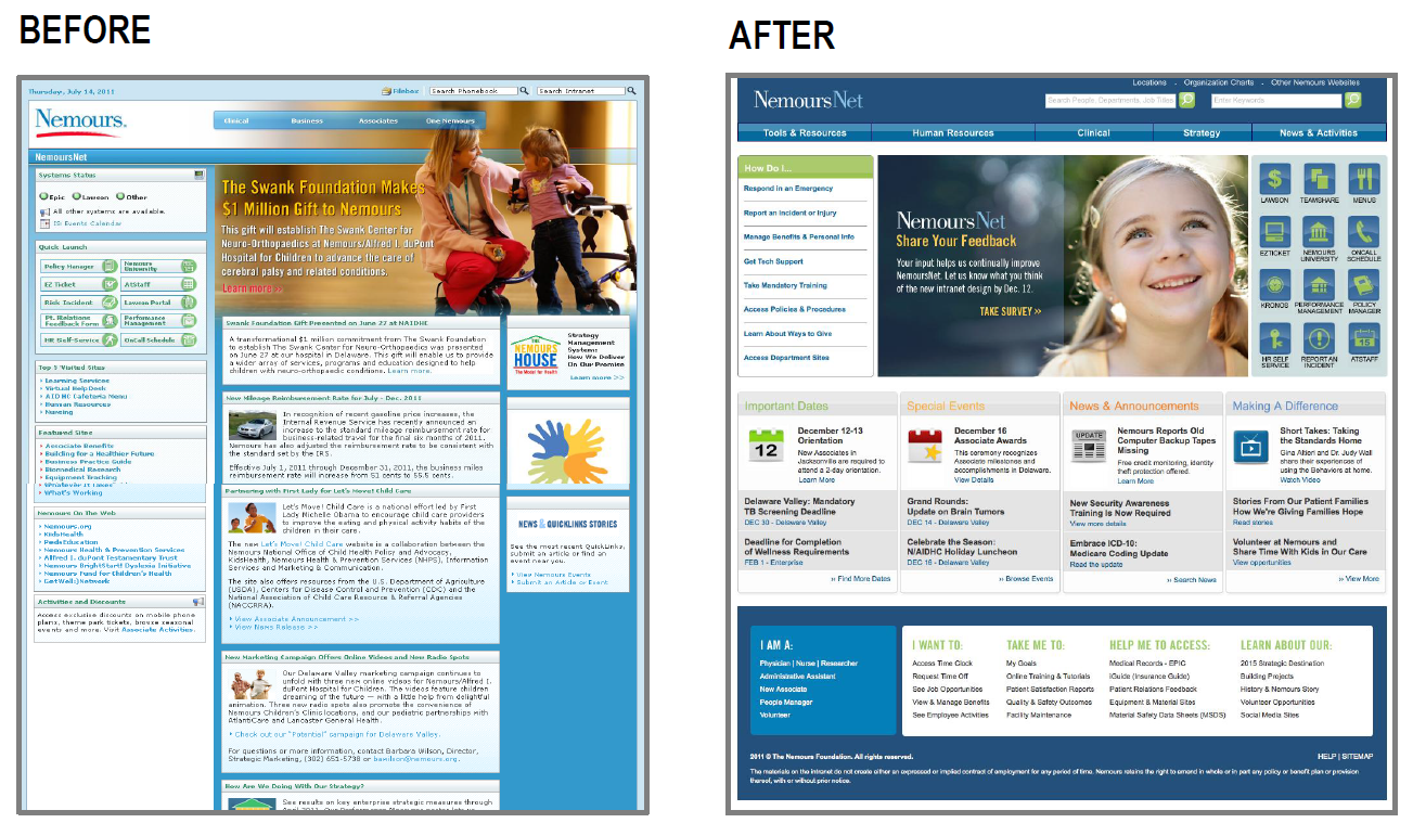
The 2011 redesign was a response to employee feedback indicating that the existing intranet wasn’t doing the best job possible. Though not unattractive in appearance, the previous version suffered from visual clutter, arbitrary arrangements of information, and a navigation structure based on organizational hierarchy instead of strategic goals and employee needs. Associates rated it just 2.9 on a five-point scale for ease of use, and complained about difficulties finding the information they needed, as well as awkward navigation and a lack of intuitive design.
A change was called for. Following extensive surveys and usability tests, the design team developed new information architecture, a fresh visual look, and more accessible navigation elements, while retaining some familiar and proven features. The new Nemours Net incorporated more logical subject groupings (based on user feedback), added some tools to aid in frequent tasks while keeping established search tools, made navigation transparent, and maintained popular “quick link” icons to provide consistency.
A quick look at a sample of the new landing page tells the story. A navigation bar on the upper left titled “How Do I …” leads users to sections on responding to emergencies, getting tech support or training, and more. Another tool across the bottom of the page gives a personal touch, allowing associates to access a time clock, request time off, look at patient satisfaction reports, and more. In between, employees are treated to clear listings of important dates, special events, news and announcements, and other relevant information.
The results of the redesign come across in associates’ ratings. The new Nemours Net shows an increase in ease of use over the previous version (70 percent, up from 49 percent), and 80 percent of employees surveyed said the information they find there is reliable and up-to-date (compared to the older version’s 57 percent). Help desk requests related to intranet problems are down approximately 65 percent.
All in all, it’s a new look and a successful redesign for Nemours’ Terri McAnich and her team, and a first-place win in the Best Intranet category of Ragan’s Health Care PR and Marketing Awards for 2012.
To view screenshots from the winning intranet, click here.
View More PR Daily Awards 2012 Winners.
Visit Ragan.com/Awards to learn more about awards opportunities.


