Internal news site redesign complements update to communications strategy
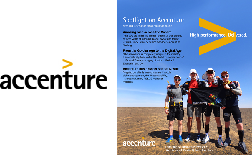
Stunning, disruptive photography takes center stage on intranet page and in email alerts.

As Accenture introduced a revamped internal communications strategy, the IC team wanted the design of the company’s most important internal communication vehicles to reflect the new strategy.
To grab employees’ attention—both when receiving email alerts about new online content and when visiting the Spotlight on Accenture site on the intranet—the team wanted to be disruptive, and achieved that goal with images that were large and bold. The design also shifted away from the table-of-contents approach (listing as many articles as possible) to one of quick, snackable content, reflecting a trend in digital publishing based on reader preference. Even the site menu adopted an image-based format.
Readership has grown steadily as a result of the redesign (and the great content that underlies it), and employees are using the internal social network to “follow” Spotlight on Accenture; more than 17,000 employees stay abreast of updates through the internal network.
Employee satisfaction with Spotlight on Accenture has also grown since the redesign, according to feedback solicited through the promotional postcard that notifies employees of interesting new content.
Spotlight on Accenture is the clear winner of Ragan’s 2014 Employee Communications Award for Most Improved Electronic Design. Congratulations to Kirsten Stafne and Jim Masters, who managed the redesign.
View More Employee Communications Awards 2014 Winners.
Visit Ragan.com/Awards to learn more about awards opportunities.


